Welcome to Amplified Apartments, a blog series about apartment hackers who’ve made strides against the mother of all city-dweller dilemmas – square footage.
This week Amplified Apartments takes us to downtown White Plains, New York. There, Valerie, a working mother, is living in a 650 sq. ft. home with no compromises. Thanks to a few wise decisions and a healthy grasp of harmonious aesthetics, Val and her husband were able to create a space for themselves and their newborn daughter, without giving up their beloved adult decor.
The key to their home’s interior design success was simple – make the small-space problem an opportunity to create intelligent, functional solutions. When a baby made three, the home office space in the young parents’ bedroom had to be replaced with a nursery, forcing the office desk into the living room. What could have turned into a clunky mismatched communal space and a baby-dominated master bedroom turned into an innovative, multi-functional family space?
With shrewd tips and photos, the industrious mom explains the game plan that gave her the home she wanted, no ifs, ands, or buts.
What were your must-haves when designing your space? Did you have to make any compromises?
I wanted to make sure the place didn’t look cluttered. We needed a space that was conducive to family living but also a one in which we could still entertain. With a few key choices, we were able to fit everything we wanted into our condo, including a home office. We didn’t make any compromises!

How did you achieve two functional spaces in one room like you did in both the bedroom and living room?
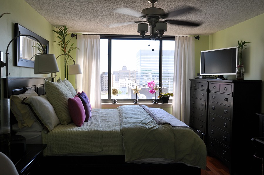
With the bedroom, we chose a color—lime green—that suited an adult and baby room. That was key. We also chose to put the crib on the opposite side of our bed so that we could decorate around it and make it more nursery-like. I love that the baby’s corner is its own space that’s a bit more sweet and youthful. It’s allowed our side of the room to remain very much a master bedroom.
In the living room area, we used a large corner table that also served as our home office to divide the room into two separate living and dining spaces. This way, we were able to use living room furniture and decor on one side and dining room cabinets and accoutrements on the other.

Besides functional differences, you also incorporated two separate designs in your bedroom. How did you accomplish that without the room seeming disjointed?
I’m a broken record when it comes to color. We tied in the nursery with crib bedding that complimented our own, so a similar color scheme flows throughout the room. And we purposely chose to install neutral light fixtures and curtains to keep the room soft and baby-friendly.
Don’t kid yourself. Color is the best way to set an age-appropriate tone in a room.
Were there any drawbacks to moving your office into a communal space? How did you overcome them?
Yes, the office table was huge! We originally placed it on the other side of our bedroom prior to the baby’s arrival. When we had to make room for the crib, there was nothing we could do but bring the table into the living room.
It was a hassle, but we knew it could work if we gave it more purpose and dimension. We ended up only using the corner unit office table and had it divide the living room from the dining room. Now it functions as a buffer and a mini-bar when we entertain.

What’s the inspiration for the wall installation in your living room? Did you make it yourself?
No, I didn’t make it myself. I don’t have time for that anymore! Originally, I was looking for something vintage, but I changed my mind and decided to incorporate playful touches that my kids could also enjoy and benefit from.
Pick toys to match your aesthetic. Don’t let your space turn into a kiddie playpen.

How did you avoid the typical clutter that comes with raising children?
It’s all about furniture with storage. I learned that lesson in college, and I use it now as an adult with finer taste and more room. For example, the coffee table has enough space underneath it to hold all of the baby’s toys. Our platform bed also has a number of deep drawers which now store the baby’s clothes and more toys. There are always more toys.

What are your go to stores for home furnishings and decor?
Homegoods and Pottery Barn, all the way.
What’s your number one tip for solving the small space problem?
Pick furniture that will help you avoid clutter. When we renovated our kitchen and bath, we chose cabinetry that would allow us to utilize the entire wall space, both horizontally, in the bathroom, and vertically, in the kitchen. It’s all about making the most of what you’ve got.
Want to share your space?
Email ForRent.com to feature your own Amplified Apartment or Home.
See your interior design creations on the ForRent blog!

