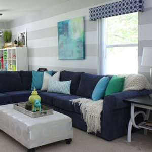
Color and pattern are two of the scariest elements for novice decorators to incorporate into a room. Fear of the results looking mismatched, disjointed, or “too much” causes many of us to keep our rooms simple and neutral. As a lover of color and patterns myself (and being someone who will almost always give color a try), even I struggled with pulling my current family room together in a way that felt fun, fresh, and vibrant. Although the “bones” of my room were solid, it wasn’t until I added some simple doses of a few bright accents that the whole room finally came together. Now instead of a glum and subdued lounge room, it’s a happy room to play, create, relax and create family memories! Let me show you what I mean!
In the past, I’ve been guilty of adding too much color to a space. Color on the walls, art, and bright furniture all together created sensory overload that felt unbalanced, chaotic, and visually stressful. In an attempt to right my ways, I designed our current family room with a very light and neutral base: light colored walls, cream carpeting, and navy upholstered pieces with all-white accents. (Although navy blue is a color, in this scheme it acts as a neutral!)

With this neutral base in place, I was still hesitant to add too much color because I really wanted this space to feel pulled together but not too wild. As such, I decided to incorporate throw pillows, lamps, and other elements in more of the same hues: whites, blues, and blacks. With these elements in place, it was disappointing when the room felt completely flat. The monochromatic color scheme was heavy and too formal for our young family, and the lack of color seemed like an obvious oversight rather than an intentional design choice.


The same held true for our entryway: a space featuring a neutral background with black frames, white elements and silver accessories. The space looked decorated and pulled together yet it didn’t have any energy or visual interest.

After months of feeling discontent in the dark neutral space, I decided to take a step back from the design I was working toward (neutrals, neutrals and more neutrals). I examined inspiration images for rooms that emitted the feelings I wanted for our room: fresh, energetic, youthful, light, airy, and happy. I decided on color schemes I loved and did some strategic and budget-friendly shopping to find just the right pieces to incorporate with my neutral base. With the addition of some oversized art, new throw pillows and a few decorative accents in a bright and consistent color scheme, all of a sudden I had a space with an entirely different energy!


The same held true for my entryway. Adding a simple yellow consol table, painting all my frames white and adding colorful prints and other small accents gave my entryway a fresh and vibrant feel!


In the end, my gut instincts about the neutral base were spot on. Neutral walls and large-scale items (i.e. furniture) created the perfect backdrop on top of which I could layer any number of color combinations to create different moods. Adding dark, monochromatic elements created a room that felt dramatic and formal, while adding pops of color in the form of art, photos, pillows, throws, and decorative accessories resulted in a fun, fresh and energized living space!

One of the best parts of decorating with this approach is that it’s relatively easy and inexpensive to change your décor scheme based on your mood, season, trends or personal whims! When I tire of my cool and crisp turquoise and lemon color palette, swapping out the art, pillows, and accent pieces can create an entirely different room with an entirely different feel…all with minimal work and a small budget!

Do you need more ideas for incorporating pops of color into your apartment? ForRent.com has tons of resources available to you. Check out these color inspired articles and also be sure to download your free copy of the Fresh Start e-Guide, which will give you all sorts of tips for incorporating the season’s hottest colors into your home with ease!

